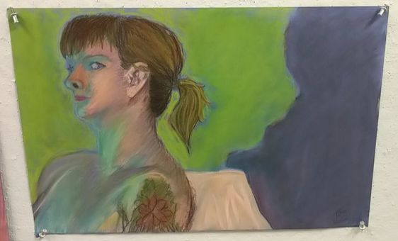
Name: Feeling the Blues
Date: July 20, 2018 Medium: Dry Pastel Size: |
Exhibition Text: “Feeling the Blues” made out of dry pastels is inspired by German artist, Ernst Ludwig Kirchner. His expressionistic pieces with a non realistic color variation got me to study more of his work and try it out for myself. This piece has a blue light shining down on a model, this was a big step for me as I had to paint on how the colors laid out on her body. Her large shadow balancing out the rest of the piece and the green background making the rest of her pop out. |
Inspiration
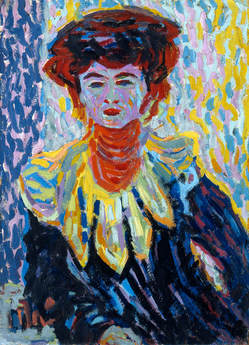
“Doris with Ruff Collar.” Museo Nacional Thyssen , www.museothyssen.org/en/collection/artists/kirchner-ernst-ludwig/doris-ruff-collar.
|
When coming across this piece, what caught my eye was not the strokes that Ernst made, but the colors he used for this piece.
The very limited color palette of cool colors and small amounts of reds and yellows show that he was going for a more expressionistic feel. For my piece I wanted to challenge myself by using a cooler color range as the model had a blue light on her and this piece helped me just dive right in with the color to let me know as a refrence what colors go well together. For example on the face of the woman to the left, she has a lilac layer all over her face with very small strokes of the rest of the colors around her. Like; red, yellow, and orange. |
Planning*I made this in a figure drawing class at MIAD and was not able to take any photos for the fact that we had nude models, but I will be descriptive.*
|
When we made this piece at MIAD, we did not really have time to make planning sketches, we just went in and went with the flow because we had a certain time limit in which we had to finish our pieces. Although I wasn't able to take pictures I still know that before I started I took time to take a stick and reach my arm out in order to measure how far I wanted to draw the model onto my paper. For example I had to measure her head and her shoulders and see if one way was better before I actually laid down some color onto the paper. Another way I planned for this piece was by sorting of the colors I was going to use, for example I used light blue, dark blue, green, purple, yellow, light pink. cream, yellow-green, etc.
|
Process
*I made this in a figure drawing class at MIAD and was not able to take any photos for the fact that we had nude models, but I will be descriptive down bellow.*
- The first thing I did was draw out the model and position her pose on to my paper. The reason I have her far more to the edge of the left side is because I wanted to get part of her shadow into the piece. Another reason for it was because of where her head was facing, it was coming out just a little bit towards me and I just thought it would all look better if I drew her on the left side of my paper.
- The next thing I did was "throw on some color" which is what I call when I just add a layer of colors everywhere just so I know what colors I'm going to be using for the piece. This helps me plan ahead and finish a lot faster for the fact that when I know what certain shade of blue or purple I'm going to use I can just move on to another part of the piece and figure out what color fits best there according to the lighting also thinking about how a shadow will affect it. For example, the background is a completely different color than her skin tone. The way I found a way to chose between the colors so they could go well together was by shading in the paper with certain colors that I pick out, but if I think it should be a different shade then I could just change it by layering another color later on.
- After that I begin to focus on certain parts at a time, for example I would focus on just the face and then move on to the heir, or her chest. When it came to the body, I kept having to go back and forth with the cool colors because I really wanted it to blend together and look as if it was on her body and not just laid out onto the paper. A way I would have to do that was by layering a more pinker shade mixed in with yellow and go in between strokes of blue or green to make it look more blended in together.
- Following that I moved on to the things around her like her shadow and the chair. Since I intentionally made her body not be blended and have visible strokes of color, I decided to change it up and balance the piece with a more cleaner look by blending the colors in the background and doing a cut out of her to represent a shadow on a wall. The pink cloth on her chair has smooth folds that look so gentle compared to the skin and hair. Then I moved on to what was going to be behind her, at the time there was noting there, no objects, no wall, nothing. So I decided to push the expressionistic feel to the piece and use a bright lime green in order to make the model pop out.
- The last thing I did was add finishing touches, like the tattoo on her upper arm or her, the hair, and her ear.
Experimentation
One way I experimented with this piece was definitely the colors I chose and how I was going to lay them out. When it came to the body, I kept having to go back and forth with the cool colors because I really wanted it to blend together and look as if it was on her body and not just laid out onto the paper. A way I would have to do that was by layering a more pinker shade mixed in with yellow and go in between strokes of blue or green to make it look more blended in together.
Critique & Reflection
If I was to make this piece again I would try to be more bold with the blues and the greens, in other words make it be more expressionist. In my inspiration piece, Ernst uses little to no normal colors in the skin tone of the woman and I should do it more like that instead of having a blue light lay on the model. I feel like I was being to gentle with the piece and not laying out the color with confidence.
The one thing that I could've done differently would be to not spend so much time drawing out the model and seeing if my proportions are right but to get the colors right. The reason for my critique is because I know that I can get proportions right I just want to challenge myself more with color variation and line technique.
The one thing that I could've done differently would be to not spend so much time drawing out the model and seeing if my proportions are right but to get the colors right. The reason for my critique is because I know that I can get proportions right I just want to challenge myself more with color variation and line technique.
Connection to ACT
1) Clearly explain how you are able to to identify the cause-affect relationships between your inspiration and its affect upon your artwork.
My piece resem
2)What is the overall approach the author has regarding the topic of your inspiration?
3)What kind of generalizations and conclusions have you discovered about people, ideas, cultures, etc. while you researched your inspiration?
4) What was the central idea or theme around your inspirational research?
For this piece, there wasn't a theme but I did want to switch things up and learn how to use cool colors, because most of the time I do not go for colors like that so I just wanted to challenge myself.
5)What kind of inferences did you make while reading your research?
The inference I made while doing my research was what colors the artists used in their pieces to make it have an expressionistic feel to it.
Bibliography
Kirchner, and Ernst Ludwig. “Doris with Ruff Collar.” Museo Nacional Thyssen-Bornemisza, www.museothyssen.org/en/collection/artists/kirchner-ernst-ludwig/doris-ruff-collar.
