|
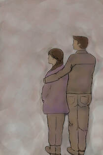
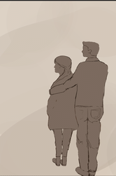
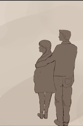
Name: Us Against the World
Size: 24in x 36in Medium: Digital Illustration Date: 11/28/2018 |
Inspiration
|
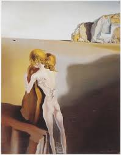
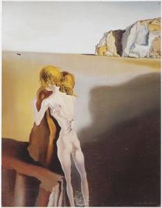
My inspiration comes from Salvador Dali's work ( ....) for the fact that the colors in the piece really caught my attention. Reasoning for that is because he used a limited color palette was used with nearly every part of the painting being a dull hue of yellow or grey. This practice conveys a sense of emptiness or despair which is why the figure in the painting holds on to the rock so intensely.
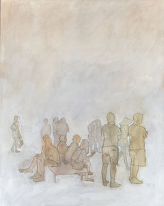
An ominous shadow looms over the scene creating a sense of fear and anticipation for the viewer. As for the Milwaukee artist; Stephanie Barenz, her piece (...) is mainly focused on a monochromatic color palette and unidentifiable human figures. Not too much detail put in the piece only a bold black line going around the figures body outline and visible line marks around the piece to give an impression of an open sky, it balances out with so many figures placed right in the bottom and all the open space left on top. |
Planning
|
|
|
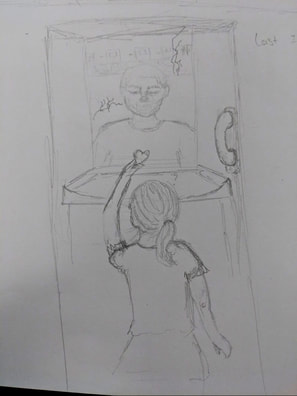
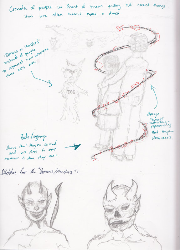
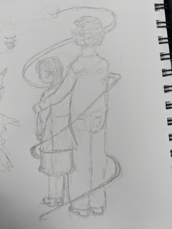
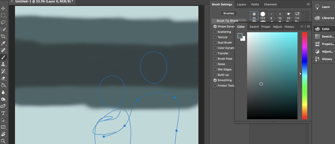
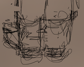
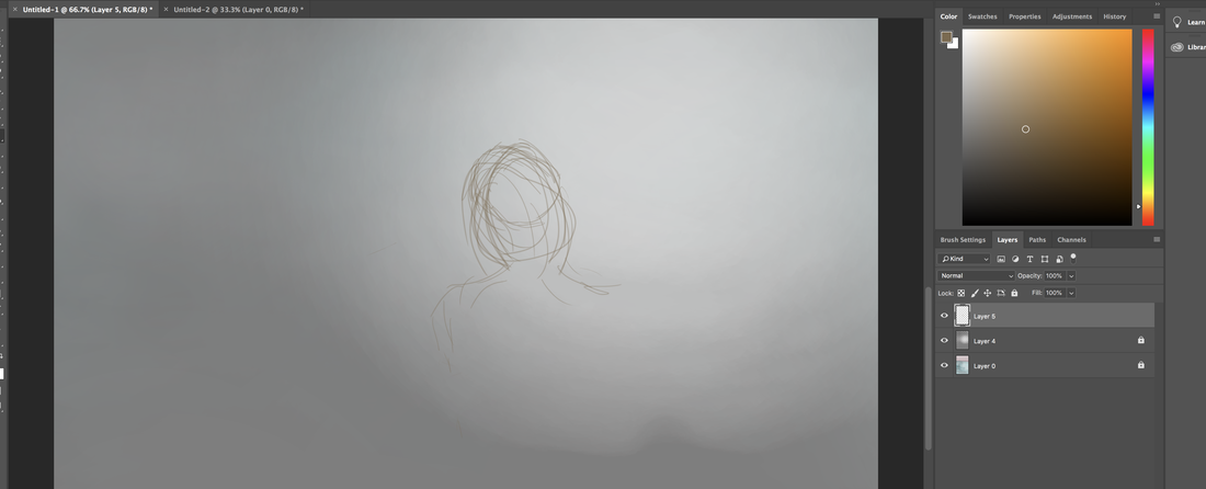
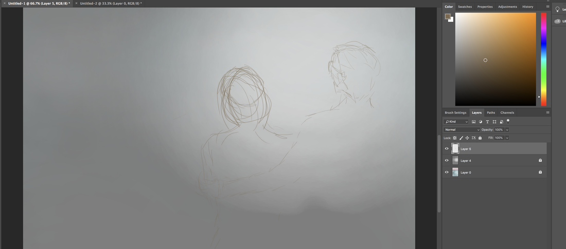
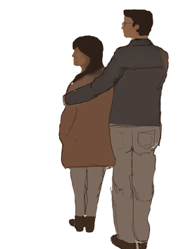
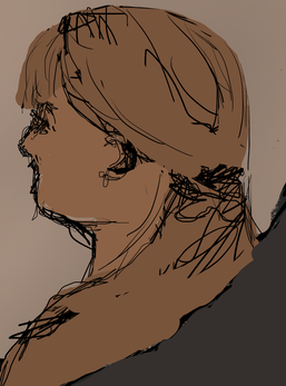
I quickly wanted to make a sketch on something that popped into my head and it was on the last moments of when I saw my father sitting on the other side of a glass window but it just wasn't what I was going for so instead I came up with the idea to make something less realistic which is out of my comfort zone for the fact that I prefer to make things that are seen everyday and not made up. So I knew from the start that this project was going to be a bit tough for me. In my second sketch above I have several sketches of "demons" which are representations for those people in society that are against immigrants. Again I found myself having a hard time because I couldn't think of how one would look so I went from something that would look like the devil to something you would see in the movies. In the last sketch to the right I have the main people that was what brought this piece in the first place. I wanted to show a little girl and an older young man holding her close to him because that's all they have, themselves against the world. The twirl going around them was just a subtle way for me to incorporate the butterflies going around them to give the viewer a hint that they're dreamers. Also the twirl is just another hint that they feel more isolated from the others.
Process
|
|
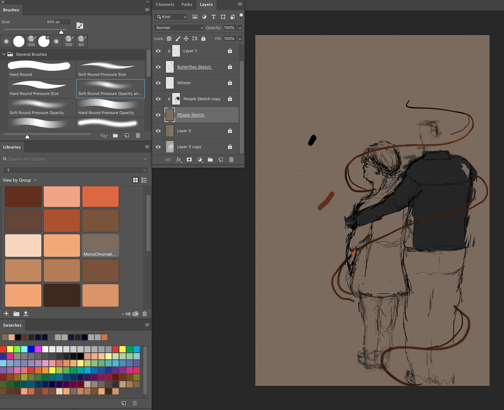
Since Photoshop is quite new for me I decided that the first thing I should do is play around with all the tools and see which ones fit me best for what I'm looking for.
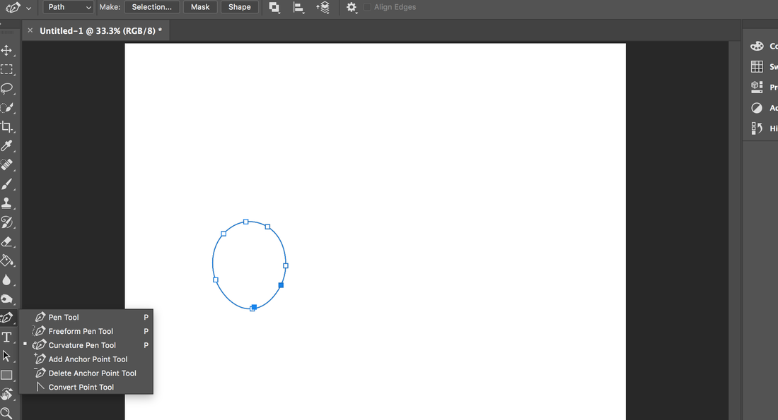
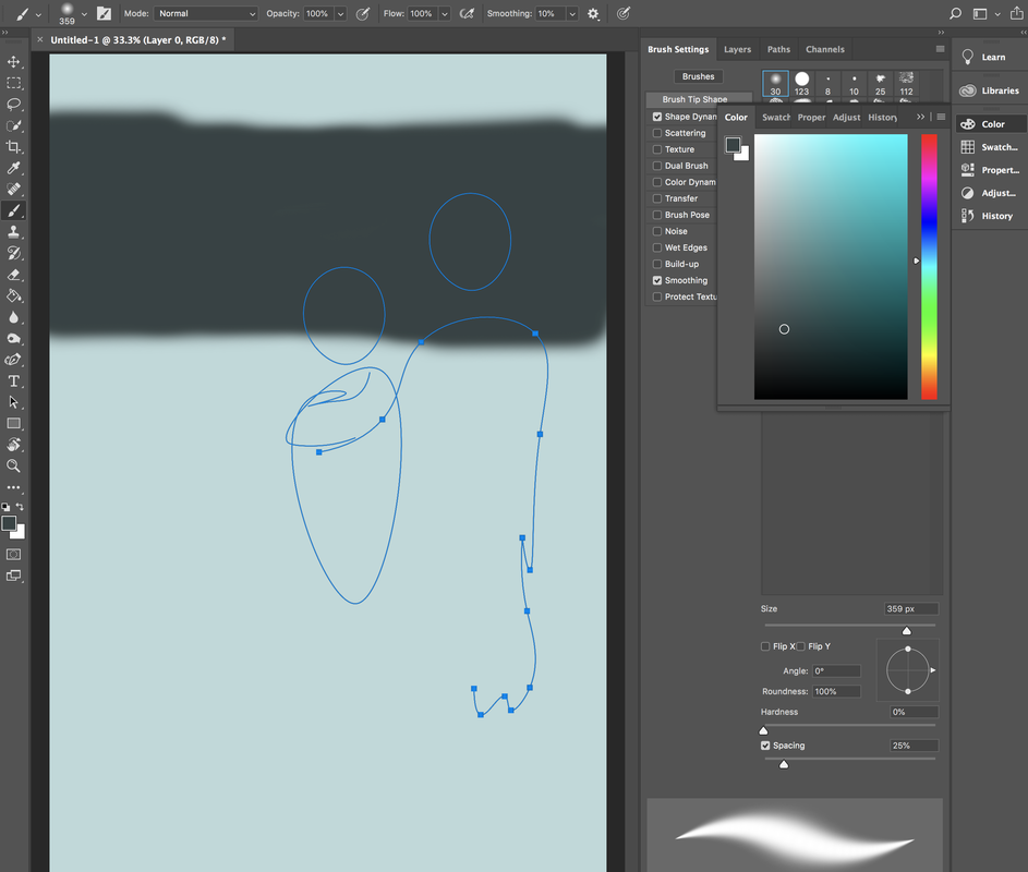
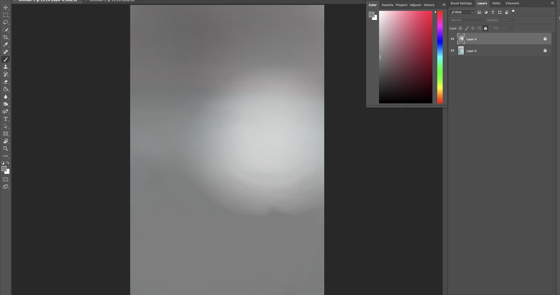
The first thing I began to play around with was the pen tool. In particular the curved one where I could lay out the little girl and the older brother. I noticed I was having a hard time getting smaller details so that's when I realized that I could move on to brushes. As long as I knew where I was going to lay things out, I was happy. I began to pick out a light blue shade just for a general background color. |

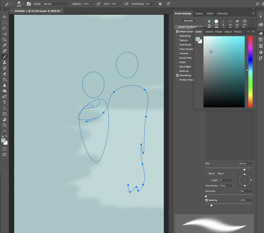
Then I went in a gradient and tried to practice with layering darker colors on top of one another and trying to blend them out with a color that would match both. I started to notice that for everything I needed a different brush. Also opacity was a big thing for me. If you notice the haziness between the grays in the fourth picture to the sixth, Its very different because I know that I want the crowd behind them to be exaggerated (in color) but not too much to the point where the piece becomes less balanced.
|
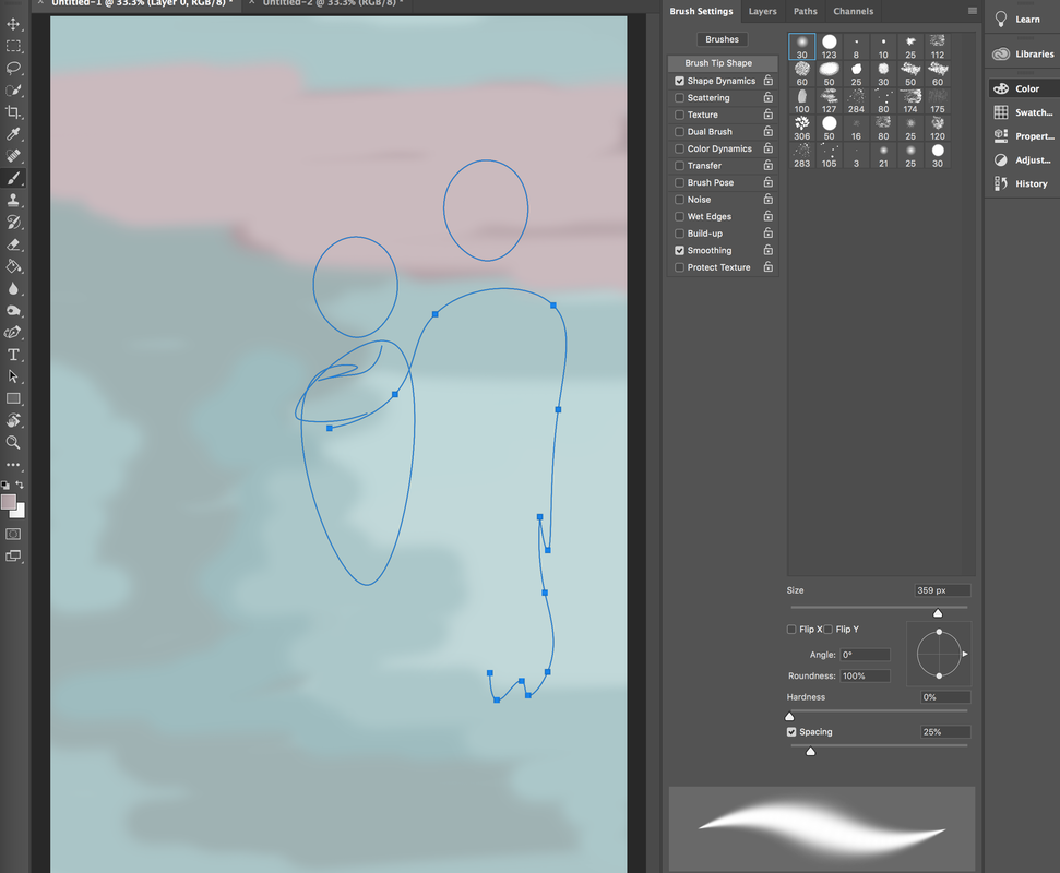
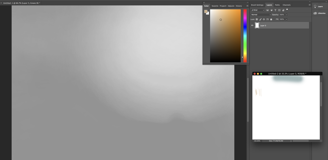
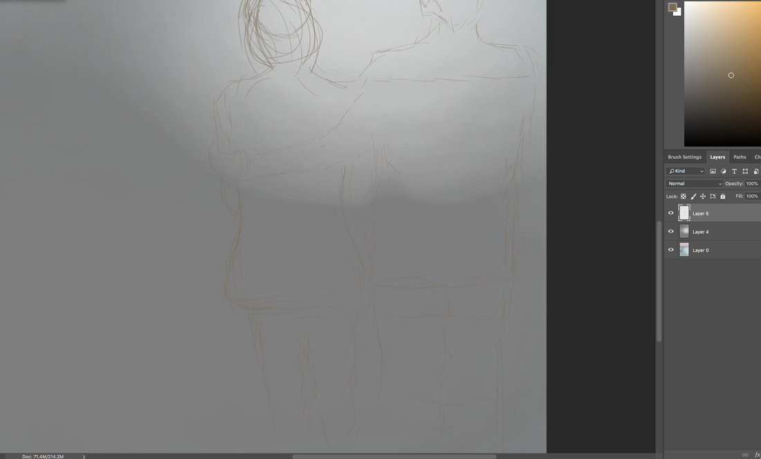
In the background I made the majority a gray color and then put a bit of a highlight in the right hand top corner. My reason for doing that is because I wanted the main people from the illustration to stand out without me having to try so hard so something simple with a highlight in the background seemed right. Then I proceeded by making my brush size smaller and using it as a sketch to where I wanted them placed. As my first time trying this technique I thought it would help because i was referring back to when I would paint with acrylics, I draw out exactly where I'm going to lay the paint. For example if I were to paint a flower I would draw it on first and then add the paint so I can get a more accurate looking flower in the end.
|
|
|
|

Tools Used
|
For this piece, the tools I used were all from Photoshop & my Wacom Tablet

|
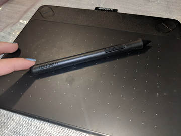
Another tool I used was a Wacom tablet the Intous and the pen that comes with it.
I made sure i was well calibraed as I was going to be creating precise line work |
|
Brushes
For brushes I stuck to mainly three of them for the mayority of the piece and just changed the size depending on what I was looking to accomplish. For example, when I wanted to color in the mans sweater, I would use
|
|
|
|
Colors
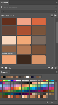
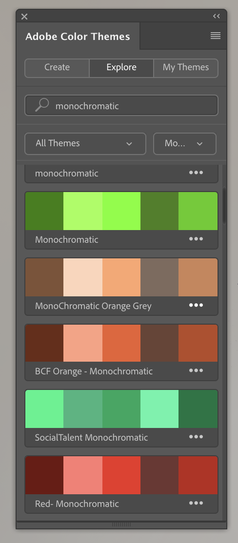
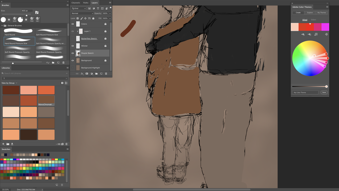
For this project I wanted to work with a limited palette, to do that I used the Adobe Color Themes and first saw all the themes that were already made and saw if any had what I was looking for. I clicked the search button to make things quicker and typed "monochromatic." On the far right picture shows a screenshot of the results. I chose the Monochromatic Orange Gray and the BCF Orange- Monochromatic palettes.
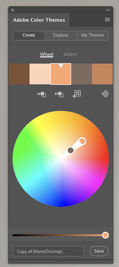
The second picture shows a color wheel and how I edited the first one I chose. FOr example I saw that some of the light |
|
|
|
browns were too similar and I wanted to make one of them a bit darker so in order to do that I would just have to move the dots on the wheel and then adjust the bar on the bottom of the wheel to make it darker or lighter depending on what I was going for. The first picture on the left just shows a screenshot of the color palette I saved for the piece, I didn't use all the colors but I had them there just in case.
Experimentation
|
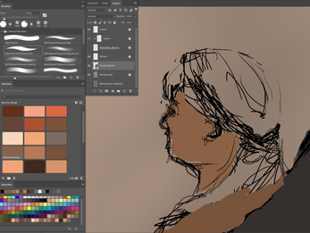
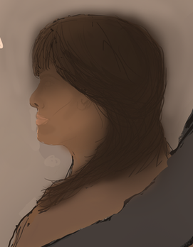
For the girl I started out with one layer in which I could have a general outline of where I wanted her and a second layer for color and detail. Later I would merge the two together so I wouldn't have so many layers when they serve for the same purpose at the end of the day. For the first picture on the right, has a a few lines for me to know where I should place colors, for example the hair and the face. Then the second picture is just a bit more detailed, Its a bit faded out as I was trying to get her hair to be darker and I was using a larger brush. Also around her face you can see marks of a darker shade to give depth.
|
|
|
|
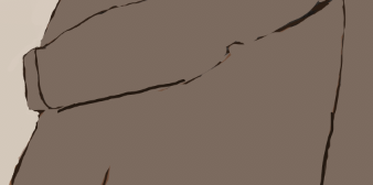
The picture on the left shows me trying to place the colors I chose onto the piece ans seeing which one looks better where. For example I placed the light brown on the girls jacket and a dark gray on the young mans jacket so it could overpower the brown and then a lighter gray in his pants to differentiate from all the other dark bold colors.
I later went in to change that and used a light gray in both of the figures, the reason I did that was because in Barenz piece she uses a monochromatic palette, as mine was it was just too dark and made me want to put in more detail when that was the opposite of what I was looking for because I was not trying to create something more realistic but rather figurative. |
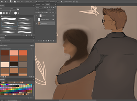
Adding in some arrows to give myself a sense of where the light is going to come from so I know where to place shadows, I moved on to the man and the details of his face and hair but it was at this point when I realized that I didn't need all the detail in the characters as long as I had general outline and color to show what I am trying to portray just like my inspirations did in their pieces.
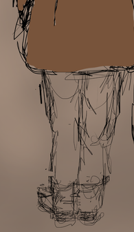
I later went in with the same light gray I added into my color palette that I used for the young people "dreamers" and covered all the details I created that gave them personality. I then went in with a very dark brown and outlined certain important features such as hair, hands, and clothing.
I later went in with the same light gray I added into my color palette that I used for the young people "dreamers" and covered all the details I created that gave them personality. I then went in with a very dark brown and outlined certain important features such as hair, hands, and clothing.
|
When crating the background I noticed Barenz had very light and loose brush strokes. So I experimented with difffernet
|
|
Critique & Reflection
As this is my first piece using digital paintbrushes, it took me a longer time than I expected it to as a learning experience. I had an initial piece in mind but as I went through it I kept adding things and making minor changes. For example, at first I had planned to have a mob of "demons" in the background but later I realized it would look to cluttered at that was not what I was looking for, so I decided to just draw one large one but even then it was not exactly how I planned it. In a good way, every change I made was for the better, and with time I learned short cuts, for example I kept one hand on the alt z while the other hand was on the tablet
Compare & Contrast

|
Similarities:
- - - - |
|
|
Differences:
- - - |
Connection to ACT |
Bibliography: |
|
1) Clearly explain how you are able to to identify the cause-affect relationships between your inspiration and its affect upon your artwork.
The relationship from my inspiration to my piece is the formal qualities and the principles of elements of design. 2)What is the overall approach the author has regarding the topic of your inspiration? The overall approach I had to this was on my theme which is on Immigration Issues. 3)What kind of generalizations and conclusions have you discovered about people, ideas, cultures, etc. while you researched your inspiration? 4) What was the central idea or theme around your inspirational research? The central theme or idea of my research was on the social issues of immigration rights and family separations. 5)What kind of inferences did you make while reading your research? That there are a lot of Latin activist artists but aren't recognized as much as others because of how controversial they can be. |
https://www.nga.gov/collection/highlights/van-gogh-self-portrait.html
https://www.nbcnews.com/news/latino/latino-political-art-has-long-history-still-potent-today-n463266 https://creators.vice.com/en_us/article/8qveab/10-artists-who-tackle-the-social-issues-of-today Krupa, Michelle. “America Is Changing. Bigoted Slurs, Immigration Bans and Racist Rallies Can't Change That.” CNN, Cable News Network, 22 June 2018, www.cnn.com/2018/01/12/health/changing-face-of-america-trnd/index.html. |
